Showing posts with label Designers. Show all posts

Monday, December 10, 2007

Eric Carlson

Eric Carlson designed the Louis Vuitton store in Nagoya, Japan. The store screams high fashion with the dramatic white spiral staircase in the center of the store. The color scheme is black, white and gold with wooden floors.
The ceiling is covered with the signature Louis Vuitton four-leafed flower shapes that protrude from the wall and are backlit for added drama. They appear like stars in the sky.
The shelves holding the products are also backlit to put focus on what they are selling. The flooring shown here is made of limestone with squares of sandstone used to give it more interest.

Zaha Hadid


This designer from Baghdad, Iraq uses a web-like design in much of her work. In this case, it is in the interior of the Moore building in Miami, Florida. The web design pulls the viewers eye from one side to the other creating a much more visually active space.
Here she uses the web-like pattern for a table. The use of diagonal lines give this table lots of movement. I am particularly fascinated with the reflective metal used on the table. I can imagine myself eating at this table and looking down and catching a glimpse of myself with food on my face. I'm not sure how appetizing that would be, but it is pretty all the same.

This is the Contemporary Arts Center in Cincinnati, Ohio and it was Zaha Hadid's first commission in the US. The design is much different from the first two I displayed. It is very geometric with the squares protruding off the building compared to the organic shapes of the web-like designs. I like the color she used here with one black cube and all the rest in a gray color.

Jane Churchill

Jane Churchill designs wallpaper and fabrics with fun, feminine prints. This fabric depicted here is of a velvet material from the Caro collection. I love the bold statement the fabric makes with the dark red contrasting with the stark white.

This is a wallpaper she has designed with a leaf motif in shades of cool colors.
This was my favorite wallpaper I found. It is a color combination that I have never seen with the pink in the background and the cream of the bamboo leaves and then the dark red of the leavs in the foreground.

Jurgen Mayer H.


Mayer is a German designer with an affinity for geometric, triangle patterns. This is the Court of Justice in Hasselt, Belgium. The shape of the building is quite odd as it is an irregular shape. The walls are covered in windows forming a geometric pattern that I find quite unique and interesting.
This is the cafeteria at the university in Karlruhe, Germany. Mayer again uses the geometric patterns on the exterior walls, but also uses them here on the interior walls and the ceiling. I like the lighting techniques here with the bars of light accenting the diagonal lines of the geometric patterns. However I don't like the colors used here because it reminds me a bit of a psychiatric ward.

In product design, Mayer has another obsession: heat sensitive materials. The product depicted here is a bed sheet that turns white when it gets warm. Although I see no practical reasoning behind this product, it would still be fun to play around with.

Fabio Novembre

Fabio Novembre's designs are very conceptual and loud.

This design focuses on the Bisazza mosaics on the walls and floor. Novembre uses a geometric pattern on the floors and then continues it up a curved wall in a smaller sized pattern. I like that the curves in the floor pattern mimic the curves of the walls.

This is a Stuart Weitzman store in Rome. The whole store is designed around a ribbon theme that is used on the walls, the ceiling, the floors, the seating and also the shelving holding the shoes. He uses a neutral color palette that helps to make the ribbon concept less shocking.

Seth Rolland

Seth Rolland is a custom furniture designer who specializes in wood. I thought his work was very interesting because it is both modern and organic-looking.
I loved this chair design with its fin-shaped back. He creates a "u" shape with the seat and then mirrors it with the arm rests. I also love that it is sitting on only three legs because it gives the chair a more modern feel.
This buffet table to me looks like upside-down reeds sticking out of the water. I love how the wood pieces create a zigzag on the floor and also on the opposite way where they meet the glass.

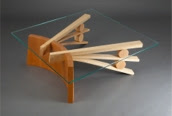
The design of this coffee table is totally brilliant. The use of different colored woods emphasis the two different shapes. While the darker arc stands on its side the two lighter fanned pieces are supported by the round pieces. Rolland puts the focus on these contrasting shapes by making the top out of glass.
The North Beach Hall table is all about balance. It looks almost prehistoric with its use of a large stone to balance one end of the table. I also like to think of the table as an "A" flipped on its side that has just tripped on a stone.

Saturday, December 8, 2007

Verner Panton

Verner Panton was a very unique and influential designer from Denmark. Although having passed in 1998 his work is still in production as its popularity never died. His work all looks like it is from the sixties yet still works today with an oddly modern feel.

This design called "The Living Tower" is a unique design as it is a piece of furniture that allows different people the opportunity to use the piece in different ways. One person may want to lay down while the other wants to sit. It allows for many different sitting positions yet it does not take up a lot of floor space because it is a sort of tower. It reminds me of a cat condo. I love this piece and could imagine enjoying it in my own home.

This "Moon Lamp" from 1960 was a surprise for me to find on Panton's website. I have seen this design before and liked it, not knowing who had designed it. This particular lamp is versatile because you can move the curved pieces to create the shape you are looking for and can even expose the bulb for more light. The Moon Lamp reminded me of Christyn's time capsule that she presented on Friday.
Verner Panton's interior designs are just as unique as his furniture. In all of the interiors that I looked at by Panton there are lots of bright colors and it is a focal point of each room. This is a picture of the Varna Restaurant made in 1970 in Denmark.

Sunday, December 2, 2007

Lorcan O'Herlihy


Lorcan O'Herlihy is an architect originally from Ireland and now has an award winning design firm in California. Pictured above is the Vertical House in Venice, California and it is actually Lorcan's house. I found this residence particularly interesting first of all because of its windows. Here he uses a tetras sort of pattern with the windows that falls along the vertical paneling of the exterior wall, which makes it very unique. I also enjoyed that he uses a very dark gray, if not black, on the outside walls because that is something you don't see everyday. Typically, exterior walls are light colors to make them more inviting, but this works I think because he uses so many windows on the front wall of the house that it still appears open.

Richard Rogers


Richard Rogers is a British Architect who is designing very futuristic buildings. The Lloyd's building in London, England is unique with a shiny metallic exterior giving this insurance company's building the look of a space ship or an engine part. There are long pipes that run down the side of the building that look as if they carry the air supply to the people inside, though aesthetically it gives the Lloyd's building the appearance of being much taller. Rogers uses the futuristic theme in other projects such as terminal 4 in the Barajas Airport in Madrid, Spain. The ceiling appears to be caving in while these odd looking supports in various colors keep it from falling down, or so it seems. I love the use of the vented sky lights, again it makes me feel like I'm up in space with a limited air supply...but in a good way.

E. Fay Jones

The Thorncrown Chapel
The Mildred B. Cooper Chapel

E. Fay Jones work was highly influenced by Frank Lloyd Wright as he was his apprentice. Both of these chapels are very much among nature and reflect the surrounding trees with wooden cut-outs. I love the way these building appear open and let in a lot of natural light, which I would assume would give the chapels a very "holy" feeling. Jones also seems to enjoy repeating patterns with the geometric crosses in the Thorncrown Chapel and then the arches in the Mildred B. Cooper Chapel. These buildings almost seem a part of the surrounding wooded area, as if they've always been there. Both chapels are popular wedding sites and I can see why. I would consider these locations if I lived in Arkansas....and if I were getting married.

Tuesday, October 9, 2007

Steven Ehrlich Zine


I loved this project and getting to research Steven Ehrlich's work. I wish I had started it over the weekend, because I rushed it and I think it could have been a lot better if I had spent more time on it.