Thursday, September 24, 2009
Window Displays
After getting inspiration from both my classmates and my own blog, I developed these four concepts for window displays in the salvation army select store. The top left, influenced by Allisyn's blog image of a display using recycled straws, I created a cascading effect for a back drop to the mannequins. The straws would be strung leaving a gap in the center of the strings to direct the eye towards the clothing but also to create visual interest as this would form a window into the store. At the ends of the straw lines the last straw would be frayed to make a star burst effect for an added detail. The use of recycled materials in this idea reflect the salvation army's reuse of clothing.
The top right idea was influenced from my own inspiration, an art piece by Kumi Yamashita who makes use of silhouttes. I wanted to include the symbol of the shield in one of designs and make use of their signature color red. The silhouttes would be painted on a semi-transparent screen (maybe an old curtain or bed sheet) and used as a backdrop behind the forms. The shield would frame the shapes and help to group them like a community.
The bottom right sketch depicts an idea I got from one of my favorite artists, Louise Nevelson. She makes use of found objects, typically wood, and arranges them into a form like a puzzle and paints them a solid color to make them one. In this display, I would make use of old chair legs or table legs and attach them to form tall columns. The columns would be lined up with little margin between to create a wall and would be painted all white. In this design I thought that including a remodeled chair would be ideal and have it painted red to symbolize the salvation army and their reuse of objects, strongly contrasting the wall of chair legs.
The final idea was the simplest but I think it would be very effective in grabbing people's attention. After our marketing for the store was finished, we could make use of all the red painted shoes that would be left over. We could create piles of red shoes around certain display areas and use it as a wayfinding tool. The bright red is sure to catch the customer's eye, so we could use the shoes strategically to guide them through out the store, telling them "this is where you should look next".
Monday, September 21, 2009
Inspiration: Art
starting from left to right: Louise Nevelson, Andy Warhol, Jerry Uelsmann, Claude Monet, Marc Chagall, Sandro Botticelli, Marcel Duchamp

starting from left to right: Robert Rauschenberg, Richard Hamilton, Alexander Calder, Frank Stella, Yamashita Kumi, Ernst Ludwig Kirchner.
I find art to be a great inspiration to me as a designer, hence my blog name. In all my years in IARc, when ever we are assigned studio projects I go down to the 2nd floor of Gatewood to look at the art student's work to help me with ideas. These images shown are a compilation of just some of my favorite pieces of art that could easily be translated into the design of a space.
Wednesday, September 16, 2009
Marketing Techniques for Salvation Army Select

1.CROCHET:
Although I doubt that many people in our design studio can crochet, I still thought that this was an interesting and sustainable way to make a product for cheap (they are made from plastic grocery bags) and my sister tells me they are very easy to make. One would just need crochet needles. I thought the coaster would be easier and could be made to put in the mailbox with a note attached putting emphasis on the re-using aspect of donating to the salvation army select and maybe giving a specific time when to put out clothes to be donated.
2. DRESS:
This idea is to set up mannequins in a public area with a lot of traffic flow on campus like the EUC. It is relatively easy to get used or worn mannequins from department stores for little to nothing. The mannequins would include signage explaining the new salvation army select store and how the students can help by donation. I particularly like this idea because it gives the students a chance to have fun with the donation process by dressing the mannequins themselves.
3. FOLD:
This final idea is an extremely cheap and easy way to market for this store. The idea is to fold t-shirts out of old newspapers or magazines or any recycled paper product for that matter and include a simple message. The t-shirts could be given to local stores, more specifically clothing stores, and they could then give them to customers after a purchase. I think the origami would be more effective than the usual flyer because of its unusual shape and hand-made appearance they will take a second look.
Monday, September 14, 2009
Timepiece: Connect The Dots
1. This is a clock I've designed to be placed in my retail space. The face is made of stainless steel and as the time passes by the faces will rotate and the holes will reveal the numbers beneath it. The small circle will represent the hours and the circle on the outside ring will represent the minutes. I was inspired by a wrist watch shown in my earlier post that was designed for someone blind and made use of raised bumps to denote the hour and minute hand.
2. I worked on stretching my concept of braille even further and began to consider feeling and the nervous system as the blind depend on their sense of touch to read. The timepiece would be a large design made of wire or string mounted on the ceiling and molded in the shape of the dendrite part of a neuron. The nervous system would be represented by wires or string and then attached to small, dim halogen lights. As the lights go off and on, they would suggest the energy released when neurons are fired. Every five minutes the lights in the timepiece would go off in succession starting in the center of the dendrite moving outward into the store. I also considered having the lights go off rapid fire on the hour, but that may be too distracting for customers.
3. For my final timepiece design I wanted to incorporate the importance of texture that I have through out the rest of the space. I considered many silly things such a sandbox that customers would mark in with tools and would show time by building up during the time the store is open. By the end of the day, you would be able to see the masses of people that had visited the store and would be clear to start again fresh the next day. I also wanted to incorporate this new idea of the nervous system so I thought of ripples in the sand at the ocean when the tides go in because they have a similar branching shape. There could be some sort of waterfall that would run constant over the sand creating these "veins" in the sand. However, I think this might be hard to recreate. I even considered an in store ant farm recessed in the wall as shown in the image above. The ant farm would obviously change over time as the ants explored new spaces and the tunnels would branch out into the dirt similar to the nervous system and from far away the ants just look like (what else?) dots!
***The color of this image was distorted on blogger, sorry!
Friday, September 11, 2009
A Timepiece


These are a few unique watches for the blind I found online searching. The first is the Haptica braille timpiece that has a moveable part in the middle that rotates to expose the time in braille. The second timepiece is the x-watch by Damien Kozlik which tells the time by use of LED lights. Where the strands cross the numbers converge and show the time. The middle also has raised numbers in braille. I specifically enjoyed the last one shown, however, because it is so minimal and sleek. Time is shown simply by a large dot for minutes and a smaller dot for hours.
Friday, September 4, 2009
Connect The Dots- Material Board
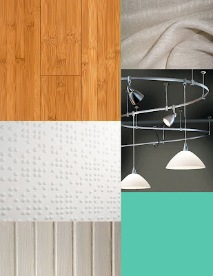
The design for this undergarment and sleepwear store will be based on the concept of braille. I love the idea of braille because it is a form of communication and it offers a unique texture. Both of these aspects of braille were important to me and I wanted to convey this within the retail space. I chose materials with varying textures for the space also to relate to the merchandise. When buying sleepwear and undergarments the most important thing to me is what the material is and how it feels. I tried to reflect the braille's dots in other ways through out the space with the pendant lamps and the resin and cocoa cylinders. With the cylinders, I planned to arrange them in lines with the manniquins on top interacting with one another to suggest the communication aspect of the braille. I want the merchandise to be what "connects the dots".
Materials Collage
These are some materials that I am using for my sleepwear/undergarment store design. I based the room around braille so I wanted to emphasize texture in the space encouraging consumers to feel the merchandise. I also picked a warmer toned flooring with the bamboo to create a more intimate feeling in the store. If people are buying undergarments they especially don't want to feel uncomfortable in their environment. I chose a teal color called Shorline Green from Behr to use on the walls in between the braille textured wall flats. This will help to break up the busy pattern and provide added color in the space.
Wednesday, September 2, 2009
Connect The Dots...
Braille is my new inspiration for our current assignment in my retail design studio. We are to create a materials board for a retail space with a given concept. I was assigned to design a sleep wear and under garment store with the concept of "connect the dots". From there, I eventually found an image in a design magazine (I forget which one) of a printed wallpaper modeled after braille. I love the idea of varying textures with the raised bumps and I would like to create a design with differing sizes of braille within the space.
Palette Generator

I attempted the palette generator for inspiration using a photo of my sister and her husband at their wedding in the mountains. I loved the color palette that was generated with the pale greens, grays, blues, and pinks. These colors will surely inspire a soothing retail space.
Subscribe to:
Posts (Atom)


