Tuesday, December 11, 2007

Chick-Fil-A


I have always loved the Chick-Fil-A advertisements. The idea of using cows to encourage people to eat chicken instead of beef is a brilliant concept. Chick-Fil-A is a unique fast food chain because they only serve chicken, so this concept is a way to emphasize that difference. I also love that they have mis-spelled the message because it reflects the purposefully mis-spelled company name Chick-fil-A.

Slim Fast


I found this image on accident while surfing the web. I thought it was entertaining but it also says something about the product. The image is of the top of a wedding cake with a hole in the top and the groom figurine bent down grabbing for the brides hand. The text is a good size, not overwhelming the picture and the image of the Slim-Fast product is in the corner appropriately. The ad directs the viewers eye well by having you look at the image of the wedding cake first, then the text at the bottom of the page, then the product at the right.

A Beatles Album Cover


This album cover has always stuck out in my mind as the classic Beatles image. It shows the Beatles in the center dressed in different colored marching band outfits holding different marching band instruments. In the background there is a crowd of famous people including Marilyn Monroe, Bob Dylan, and Edgar Allan Poe. I think maybe these people represent the world and how great an impact it has made on the Beatles' music.

The Divine Secrets of the Ya-Ya Sisterhood


Although I have never read this book, I do own it and I am always seeing it lying around my house. The cover is very colorful and fun with the image of two girls playing leap frog. I don't know exactly what the book is about, but the cover tells me that it is set in maybe the 50's because of the style of clothing the girls are wearing. I also would guess that the story is kind of like a flashback as the image of the girls is faded with high contrast like an old photo would be. This cover design has always made me want to pick up the book and read it.

The Perks of Being a Wallflower


I love the book cover for The Perks of Being a Wallflower. The green color dominates the cover and there is a small picture of someones legs in the top right corner. I think this layout really defines the book as the main character is a misfit. The odd placement of the picture represents this. The fact that the picture is only of a persons legs I think shows a bit of mystery, because through out the entire story the main character is writing to a person who he does not know. This is one of my favorite books and I recommend it to anyone who is a bit of a wallflower.

**Please excuse the annoying arrow as I am downloading these pictures from Amazon.com

The Devil Wears Prada


Although we are not supposed to judge a book by its cover, I think a small part of us always does. This is the cover of The Devil Wears Prada. The image displayed hear of the red stiletto heel in the shape of a pitch fork has always stuck in my mind. It is very representative of the story, which is about a girl who starst working for a fashion magazine and her boss turns out to be completely evil. The title also reflects this with the "V" in Devil resembles the end of the pitch fork.

Harry Potter Book Cover


The Harry Potter book covers I think are a good representation of media design. These book covers each display a scene from the book that they are covering. What I like about each scene that is shown is that they all have a bit of mystery to it, so that you don't know exactly what is going on. In this particular one, you could probably recognize the characters if you had read the previous books but you may not know exactly what they are doing. This sense of mystery plays into the general theme of the books which is that they all are mysteries within one big adventure. I also think that the fonts used on the book titles are a good choice because they are whimsical which reflects the magic in the Harry Potter stories.

Apple


I love the Apple ads for their iPods and iPhones. This ad for the new iPod nano is very simplistic, as all of them are, with a plain white back ground and a simple text above the picture. The ad shows the different color options of the iPod as well as different artists and videos that they have displayed on the screens. I think these Apple product ads are effective because they put all the focus of the viewer on the product itself as if saying the product doesnt need anything else to sell it; and it doesn't.

Mika


This is an image of the music artist Mika's album cover. The title of this album is Life in Cartoon Motion, which is reflected in the colorful cartoon design of the cover. Mika's music is flambuoyant, creative and fun just like this design. He uses cartoon images of different colored gears and lots of clouds that I think are representing his imagination and creativity that he incorporates into a lot of his songs. The album cover also includes a small picture of Mika, which to me shows that he is of lesser importance than the music he produces.

Monday, December 10, 2007

My Definition

After studying examples of sustainable design and products that allow for sustainable design, I think I have a fairly accurate definition of sustainable design in my head. It is as follows. Sustainable design is a type of design for environments or products that incorporates ecological sustainability. Ecological sustainability can be acquired through the use of renewable or recycled materials, the reduction of emissions such as greenhouse gases, and incorportating bioretention.

Shorne Wood Country Park


This is the Shorne Wood Country Park Visitors Centre designed by Lee Evans Partnership Architects in 2006. Lee Evans incorporates sustainable design by using solar thermal panels on the roof and a wind turbine to reduce burning of non-renewable resources and reduces carbon dioxide emissions. The building is also made of wood which is much better for the environment than synthetic materials due to the release of unwanted chemicals.


Chicago City Hall

Chicago is one American city that is putting sustainable design in the forefront. Their plan for incorporating green roofs in their urban planning is smart and is helping to influence other American cities to follow in their footsteps. This is a picture of the green roof on Chicago's city hall. Although this space is not accessable by the public, it can be seen from 33 taller buildings in the area.

USC: West Quad

Little Architects designed this sustainable residence hall for University of South Carolina. Over 75 percent of the materials used were recycled and there is incorporation of bioretention that reduces and controls storm run-off. This sustainable design resulted in 30 percent energy savings for the client, USC.

Peter Danko


Peter Danko is a designer that takes sustainable design very seriously. In this diagram from his website you can see the benefits of using ply-bent wood over solid wood for making furniture. The amount of wood used is greatly decreased. Wood is also one of the only materials that puts off oxygen.
This chair is an example of the ply-bent wood. You can see that Danko is not sacrificing any style for sustainability.
This chair called "equilibrium" is made of recycled car seatbelts and the ply-bent wood painted black. The adhesives are water bourne so they do not emit damaging chemicals.


Passive Solar

Passive solar is a technology used in design that converts sunlight into heat. It requires no other energy sources. This technology reduces cost for heating buildings and emission of greenhouse gases which are destroying the ozone. When my dad built his house in the 70's, he incorporated passive solar into the design. Environmental issues were popular at that time and now history is repeating itself.

What is Sustainability?

I was a little unclear about the exact definition of sustainability, so I looked it up on wikipedia. Wikipedia explained that "the essential aim of sustainable design is to produce places, products and services in a way that reduces the use of non-renewable resources, minimizes environment impact, and relates people with the natural environment". It also explains that this has just recently become more important in design within the last few years. We are becoming more aware of the impact we are having on the world, with our recent acceptance of global warming.

LEED

Everytime I look at an architectural firms' website, or check out a design magazine I see LEED. I had no idea what it was, so I thought I would look it up. LEED stands for Leadership in Energy and Environmental Design, and it is a green building rating system that encourages sustainable design in new buildings. It also helps designers monitor how their designs are effecting the environment.

Bamboo Flooring


Just recently bamboo flooring has grown more popular. There have been new improvements in technology to make the bamboo smooth like normal wood floors. The best part about bamboo floors is that it is sustainable. Because bamboo is the fastest growing plant in the world, it is a renewable resource.

Eric Carlson

Eric Carlson designed the Louis Vuitton store in Nagoya, Japan. The store screams high fashion with the dramatic white spiral staircase in the center of the store. The color scheme is black, white and gold with wooden floors.
The ceiling is covered with the signature Louis Vuitton four-leafed flower shapes that protrude from the wall and are backlit for added drama. They appear like stars in the sky.
The shelves holding the products are also backlit to put focus on what they are selling. The flooring shown here is made of limestone with squares of sandstone used to give it more interest.

Zaha Hadid


This designer from Baghdad, Iraq uses a web-like design in much of her work. In this case, it is in the interior of the Moore building in Miami, Florida. The web design pulls the viewers eye from one side to the other creating a much more visually active space.
Here she uses the web-like pattern for a table. The use of diagonal lines give this table lots of movement. I am particularly fascinated with the reflective metal used on the table. I can imagine myself eating at this table and looking down and catching a glimpse of myself with food on my face. I'm not sure how appetizing that would be, but it is pretty all the same.

This is the Contemporary Arts Center in Cincinnati, Ohio and it was Zaha Hadid's first commission in the US. The design is much different from the first two I displayed. It is very geometric with the squares protruding off the building compared to the organic shapes of the web-like designs. I like the color she used here with one black cube and all the rest in a gray color.

Jane Churchill

Jane Churchill designs wallpaper and fabrics with fun, feminine prints. This fabric depicted here is of a velvet material from the Caro collection. I love the bold statement the fabric makes with the dark red contrasting with the stark white.

This is a wallpaper she has designed with a leaf motif in shades of cool colors.
This was my favorite wallpaper I found. It is a color combination that I have never seen with the pink in the background and the cream of the bamboo leaves and then the dark red of the leavs in the foreground.

Jurgen Mayer H.


Mayer is a German designer with an affinity for geometric, triangle patterns. This is the Court of Justice in Hasselt, Belgium. The shape of the building is quite odd as it is an irregular shape. The walls are covered in windows forming a geometric pattern that I find quite unique and interesting.
This is the cafeteria at the university in Karlruhe, Germany. Mayer again uses the geometric patterns on the exterior walls, but also uses them here on the interior walls and the ceiling. I like the lighting techniques here with the bars of light accenting the diagonal lines of the geometric patterns. However I don't like the colors used here because it reminds me a bit of a psychiatric ward.

In product design, Mayer has another obsession: heat sensitive materials. The product depicted here is a bed sheet that turns white when it gets warm. Although I see no practical reasoning behind this product, it would still be fun to play around with.

Fabio Novembre

Fabio Novembre's designs are very conceptual and loud.

This design focuses on the Bisazza mosaics on the walls and floor. Novembre uses a geometric pattern on the floors and then continues it up a curved wall in a smaller sized pattern. I like that the curves in the floor pattern mimic the curves of the walls.

This is a Stuart Weitzman store in Rome. The whole store is designed around a ribbon theme that is used on the walls, the ceiling, the floors, the seating and also the shelving holding the shoes. He uses a neutral color palette that helps to make the ribbon concept less shocking.

Seth Rolland

Seth Rolland is a custom furniture designer who specializes in wood. I thought his work was very interesting because it is both modern and organic-looking.
I loved this chair design with its fin-shaped back. He creates a "u" shape with the seat and then mirrors it with the arm rests. I also love that it is sitting on only three legs because it gives the chair a more modern feel.
This buffet table to me looks like upside-down reeds sticking out of the water. I love how the wood pieces create a zigzag on the floor and also on the opposite way where they meet the glass.

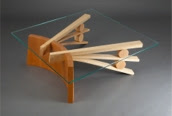
The design of this coffee table is totally brilliant. The use of different colored woods emphasis the two different shapes. While the darker arc stands on its side the two lighter fanned pieces are supported by the round pieces. Rolland puts the focus on these contrasting shapes by making the top out of glass.
The North Beach Hall table is all about balance. It looks almost prehistoric with its use of a large stone to balance one end of the table. I also like to think of the table as an "A" flipped on its side that has just tripped on a stone.

Sunday, December 9, 2007

Gap Ad

Gap has, for as long as I can remember, been putting out amazing memorable ads. Everyone knows about their famous commercial with the dancers all wearing khakis. Recently they have been using celebrities in their ads, photographing them in black and white. I particularly chose this ad because it really signifies Gap as a company for me. This ad is for Gap jeans. I love the way they use color by making everything black and white except for the blue jeans. The models look young and fun making the consumer want to buy the product. The graphics at the bottom of the ad emphasize the playfulness of the product. To top it off, the ad includes the Gap logo in the center of the page with the twist of a "blue jean" blue rather than the usual navy, and it has the appearance of being colored in, which mimics the texture of jeans.

Green Roofs


The green roof has grown increasingly popular in America in the last few years as sustainability has come to the forefront in design. Green roofs allow companies to put gardens on the roof of their urban buildings and improving the environment. Green roofs have been proven to improve air quality, keep cooling costs down, reduce stormwater runoff, and improve insulation of the building. Not to mention they look pretty. Green is hard to find in many urban areas, so this is a good solution as it does not take up valuable land and will also benefit the buildings on which they grow.

SageGlass


SageGlass windows are a new product that has just come out within the last year. The product is a window that can be tinted with by pushing a button that sends an electrical current through the glass. This new technology has been proven to reduce the amount of fossil fuels used, so it is good for the environment and it reduces the energy costs. In turn it will reduce pollution but will also save the client money. Although the product is rather expensive, in the long run it will be an investment for the client as they will save money in heating and cooling the space.

Finnish Design


This classic Finnish home was designed by Kaisa Blomstedt. The clean lines and simplistic look is ideal for Finnish design. Blomstedt uses large windows taking up one whole wall and white stucco that gives this home a clean, modern look.

Finnish glassware is famous around the world for unique shapes and classic designs. This particular vase was designed Alvar Aalto, a famous Finnish designer, in the 1930's.
This chair called "nomad" was designed by Ilkka Suppanen in 1968. The simplistic design of this chair is very representative of Finnish design. The seamless curve of the seat very pleasing to the eye and I love the way the chair legs seems to come to a point and balance on this bar on the floor.


Spanish Design

Spanish trends include stucco walls, terra cotta roofing, brightly colored tiles, red accents, wrought iron details, dark woods and stone. Landscaping is also an important part of Spanish design as plants are always incorporated into homes.
This is Casa Mila in Barcelona, Spain designed by Antonio Gaudi. It is an example of art nouveau with its curved exterior influenced by organic shapes. The patios are surrounded by web-like wrought iron and the roof is equally as organic with its curved dome-like shape. Gaudi was a famous architect in Spain and is very influential for Spanish design today.
This is a photo of a typical street in Barcelona, Spain. Within the city it appears that the car is not dominating, but rather the pedestrian. A normal car would not be able to fit down this street. This is something you would never see in an American city. You can also see some examples of Spanish design trends such as the plants on the balconies and the wrought iron accents as well as some tile work.


Wrought iron is a popular decorative element used in many Spanish designs. In this case it is used as a decoration for a wall, but it can also be used on doors, windows, furniture, and fences.
It has a beautiful contrast here against the pale stucco wall.

Leaves


This is our final drawing assignment. I used different methods of shading and tried to make interesting compositions for each square. I realize now that I cropped part of the top off, so I will fix that later.

EYP

The final website I visited was Einhorn Yaffee Prescott Architecture and Engineering. I liked the slideshow of pictures in the center of the homepage, showing that their focus is their projects that they have designed. The site is rather simplistic but I think it works here. They use orange as the accent color to highlight projects and categories that you put your mouse over. The site is well organized with the news to the right of the picture and the featured projects to the left. I liked that they had a seperate category for projects in progress showing priliminary drawings for each project. I was also nice to see the recently completed buildings also, because sometimes firms' later work can look different from their more recent work. They also put a big emphasis on sustainability by listing it as a main category. It shows that EYP is serious about the future and the environment.

ZGF

Zimmer Gunsul Frasca Architects has an innovative and modern looking website that reflects their design sense. I enjoyed the way the pictures blossom out of the blank screen displaying different projects and then fade away only to repeat itself with new projects. It was also nice to see the mission statement out on the front page rather than on a seperate page, because that way people are more likely to read it. When you click on "the work", the projects are displayed very well using bars and a green accent color to highlight the one you are viewing. I particularly liked that the site shows many different kinds of visual representations including drawings, CAD designs, and also pictures. This gives the viewer more of an idea of the process that each project entails.

3D/I

This website is bit boring in the beginning. I don't like that the main color used in the site is gray. I believe that a design firm's website should reflect their design sense, so if a site is all gray I automatically think that the designs are going to be boring. Despite this, the designs were actually quite interesting. I liked that when viewing 3D/I's projects you could look at different views of the space by putting your mouse over the pictures to the side, rather than having to individually click each one.

DBI

DBI architects has a unique website. Their entire website looks like a graphed architectural drawing. They also incorporate color well into the site with a black background, white text, and red as an accent color for things that need to stand out. However, there were a few minor things about the site though that I did not like. First of all I wish they would have used the whole page, it seemed that the site only took up the center part of the page so there was a lot of negative space on the sides that went to waste. Also on some of the pages the text appears rather small. Text should not be difficult to read or otherwise viewers will not take the time to read what the company is trying to say. I also did not like the way the projects were displayed. The website shows one main picture of the space and then has a smaller slideshow of other views of the space. I would have liked to be able to stop on the slideshow pictures and view them larger.

Gensler

Gensler's website was easy to navigate and relatively simplistic. It looked to me like a standard website. I was a little disappointed because I felt it did not have something that made it stand out. The red on the homepage made a statement because that would be Gensler's signature color, but I thought it distracted from the pictures. However, the website does offer amazing pictures and I was very impressed with their work, especially the One Thousand Steps retail store in Cerritos, California. I also liked that they had a section of their website called "what's new" that shows news releases and has peoples reactions to the new buildings they have designed. That is something I haven't seen on any other architectural firms' websites.

HOK

This design firm's website was both creative and efficient. The website opens up with slideshow of different projects that HOK has designed. The pictures were large and took up nearly the whole page except for the HOK logo and two words: ideas work. I loved that they put all the focus on their projects rather than having long explanations backing up the pictures. When you put your mouse over the word "work" a long list of categories comes up and you can choose which type of design you wish to view. Each of these pages were designed very well with unique ways of displaying the pictures. I also commend them on their photography. All their pictures colorful and showed the spaces at different times during the day. Some even used time-lapse photography which I found gave the projects a more artistic look and made it more interesting. The spaces designed by HOK were very impressive, especially their "aviation" category displaying the airplane terminals they have designed all over the world.

Daroff Design

Daroff Design Inc. is an architectural and Interior Design firm based in Philadelphia. Their website had a unique intro with lots of squares that blinked into different designs by the firm. The square theme continued on through out the website with little squares at the top of each page. The squares represent the diversity of projects that the firm takes on and each one is a link to different projects they have designed according to that category. One thing I disliked about the site was the size of the pictures. They were much too small for me to see any detail. Plus, I feel the bigger the picture is the more I can imagine myself in the space and that is something the site needs to encourage.

SOM

Skidmore, Owings and Merrill architectural firm has an impressive website. Their homepage was laid out well and organized logically. I was also impressed with their many locations over seas and their vast library of buildings they have designed. The buildings each offer something completely different as some focus on sustainability like the UNC Genome Science Lab, or the graphics on the Jianianhua Center, or the unique shape of the highrise Infinity Tower. It was incredibly easy to navigate the projects page as they organized them by several differents categories depending on which suits your needs. I also liked that they offer photo galleries of each project that really give you a feel for each project. I particularly enjoyed the partners page under people. If you put your mouse over one of the figures they change positions and tell you who they are with a speech bubble. You should definitely check out the guy 3rd from the left on the bottom row, he was especially creative.

Saturday, December 8, 2007

Random Product Designs

This is a cheese grater from the Italian company Alessi. This design I thought, was incredibly brilliant. My grandmother is always making me grate cheese and she has the worst kind of grater that never works correctly. I liked this one because it comes with a container for the cheese to fall into after it is grated. It is also small enough to hold in your hand, so it is not such an awkward task. I also love that it comes in lots of fun colors for you to pick from.


Marcus Tremonto has recently been getting lots of attention for his new product series called Ragno. His product is composed of a two-dimensional traditional chandelier made of an "electroluminescent material" on acrylic. This new interpretation of a chandelier illiminates the hassle of installations that were a major problem with the heavy classic chandeliers (as I well know). This is much easier to install and has a very young, modern look with the flourescent colors.


This is a very bold look by Kohler. It is becoming increasingly popular to have the sink as a bowl on top of the counters rather than being flush with the countertops. I love the way it is done here with the clear glass and the way the water creates reflections on the countertop. I also like to see the faucet coming from the wall rather than the counter like a shower does. The simplicity of the faucet is perfect so as not to distract from the focal point of the reflections.